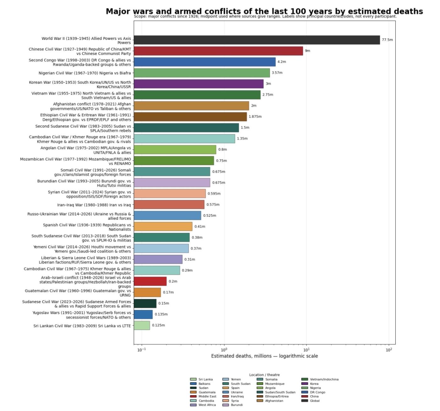
War deaths
The figures in the graph are not drawn from a single database, because no universally agreed dataset exists that measures “war deaths” in exactly the same way across all conflicts. Instead, the totals are compiled from widely cited academic and historical sources such as the Uppsala Conflict Data Program (UCDP), PRIO battle-deaths datasets, and synthesis projects like Our World in Data. These sources often present ranges rather than exact totals, reflecting the uncertainty inherent in wartime record-keeping, especially in civil wars and conflicts involving famine or displacement. To keep the chart consistent and readable, a midpoint estimate has been used wherever a range is given. For example, if a conflict is estimated to have caused between 2 and 3 million deaths, the figure plotted is 2.5 million. This approach avoids overstating precision while still allowing meaningful comparison between conflicts.
A key methodological choice was to focus on major wars and sustained armed conflicts from roughly the last century, rather than attempting to include every minor engagement or short-lived clash. Including every recorded conflict would produce an overcrowded and unreadable graphic, and in many cases the data for smaller conflicts is too inconsistent to compare reliably. The selected wars are those that are generally recognised in historical and political research as having significant human impact, either due to total deaths, duration, or geopolitical importance. Where conflicts overlap or form part of a longer continuum, such as ongoing civil wars or regional instability, they are grouped in a way that reflects how they are commonly treated in academic literature.
Another important factor is what counts as a “war death.” Different sources define this differently. Some datasets count only direct battle deaths, meaning soldiers and civilians killed in combat. Others include indirect deaths caused by the war, such as famine, disease, or collapse of infrastructure. For large-scale conflicts like the World War II or the Second Congo War, indirect deaths can make up a substantial proportion of the total. The figures used here generally reflect the broader “excess deaths” approach where credible estimates exist, as this better captures the true human cost of war, but it also means comparisons should be read with that context in mind.
The graph uses a logarithmic scale on the horizontal axis, which is essential when dealing with numbers that range from tens of thousands to tens of millions. Without this, smaller conflicts would be visually compressed and almost impossible to compare. A logarithmic scale allows the reader to see proportional differences more clearly, while still showing the immense scale of the largest wars. Colour coding is applied by geographic theatre rather than by political alignment, which helps readers quickly identify regional patterns, such as the concentration of high-casualty conflicts in parts of Africa and Asia in the late twentieth century.
One of the most striking patterns visible in the data is the dominance of a few extremely large conflicts. The World War IIalone accounts for a vastly higher death toll than any other event on the chart, which is why the logarithmic scale is necessary in the first place. Beyond that, there is a noticeable cluster of mid-to-high casualty civil wars during the Cold War period and its aftermath, including conflicts in China, Korea, Vietnam, and several African states. This reflects the combination of ideological rivalry, decolonisation, and proxy warfare that characterised much of the twentieth century.
It is also worth noting that more recent conflicts, such as the Syrian Civil War or the Russo-Ukrainian War, are harder to measure accurately because they are ongoing or only recently concluded. Their figures are therefore provisional and likely to be revised as more data becomes available. Historical distance tends to improve accuracy, as archives open and demographic studies refine earlier estimates.
Overall, the graph is intended as a comparative tool rather than a definitive ledger of wartime deaths. It highlights scale, distribution, and historical patterns, while acknowledging uncertainty in the underlying data. Readers using it for research should treat the figures as informed estimates and, where precision is required, consult the underlying datasets and historiography for each individual conflict.